3D Chart Maker - 3-Dimensional Chart Creator
Our 3D Chart Maker coverts quadrat data into a 3-dimensional chart in which the relationship between dimensional data can be viewed. This provides a powerful tool of analysis in the identification of patterns and trends. It uses point data sampled within a rectangular grid to present geographical data for three variables on axes, X, Y and Z. The Z axis is perpendicular to the x-y plane and carries the data entity value, positive or negative. The axes X and Y hold the grid coordinates.
Each plot in the 3D graphic is represented by a marker whose position depends on its values on the X, Y, and Z axes. The markers are colour-coded for up to seven different categories of data and the chart can be rotated to inspect points from different angles. This rotation helps to provide a complete picture of the data and identify outliers.
Quadrat sampling is a common tool in geography and ecology fieldwork, an important method by which data entity values are recorded. It can be used to sample number, density, frequency and distributions of a wide range of data categories. Viewing in three dimensions helps remove the noise from the data and clarify the spatial relationships between the different variables.
To use the 3D Chart maker for geography and ecology data, overlay a rectangular grid on a map of the area being studied and label the grid with coordinates. It is important that the grid is big enough to ensure a representative sample. To avoid bias, use a random number generator to choose a set of coordinates, or select coordinates systematically. The values at the sampling points within the quadrat can take many different forms. Survey totals (e.g. environmental quality, bi-polar perceptions), cost, percentage, frequency, number, size, height, density, temperature or velocity are just some of the values that could be represented on the Z-axis.
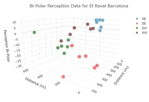
A bi-polar example of a 3D chart used to display residential quality, environmental quality and perception data for an inner city area of Barcelona, is shown below.
Enter your data in the calculator below. Click the 'Calculate' followed by 'Open 3D Chart' buttons and your chart will open in a new window. A menu appears above the 3D chart offering several options, including downloading an image. Hover over the chart to display the data. Drag the chart to rotate viewing angles. The 'Customise' button opens options to set the chart title, X, Y and Z axis labels and the key for the data marker colours.
3D Chart Maker

Example of a 3D chart used to display bi-polar perception data for an inner city area of Barcelona

