Radar Chart Creator
This Radar Chart Maker creates circular charts to display values based on multi-category or compass direction data. Axes radiate out from the centre point of the circle like spokes on a wheel. Each axis represents a compass direction, factor, category or variable, with values increasing outwards. The data for each direction or category are plotted as a point on the corresponding axis and points are connected to form a shaded polygon.
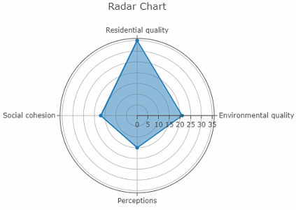
Radar charts are commonly used in geography fieldwork to display data on axes that represent different categories. An example below shows values for perception, social cohesion, residential and environmental quality data collected within an urban quadrat.
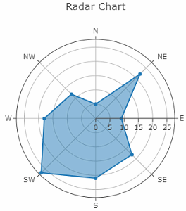
This radar chart can display values for a single category based on distribution and frequency of alphabetic compass directions. Radar chart axes labels are non-numeric and our Polar Chart Creator should be used when a 0-360 degrees numeric layout is required. Radar charts are common in physical geography fieldwork and often used to display the number of pebbles orientated along a particular compass point, or the number and direction that cirques or corries face. An example is shown below.
Enter your data in the calculator below. Click the 'Calculate' followed by 'Open Radar Chart' buttons and your radar chart will open in a new window. A menu appears above the chart offering several options, including downloading an image. Hover over the chart to display the data.
Radar Chart Maker
Multiple Radar Chart Overlays Maker


