Range Bar Chart Maker
This Range Bar Chart Maker creates floating bars that display the minimum and maximum values associated with geographical data. Data points are built starting from the minimum values and as a result, each bar shows the difference between the highest and lowest values and appears to float above the X axis. Floating bar charts are a visually appealing way of showing differences in distribution between the data entities and provides a clear message to the viewer.
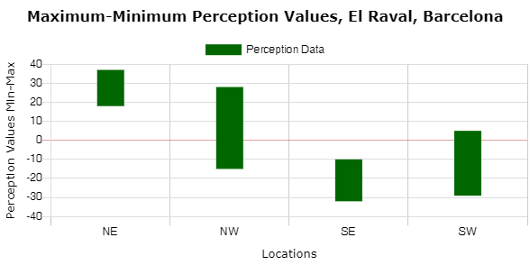
The distribution of values is an important element in data analysis. In physical geography, a small range may be associated with well sorted sediment of similar sizes, typical of bed load in the lower course of a river. In human geography, the range of data may indicate the extent of homogeneity or diversity within an urban area, and suggest further areas for investigation. A bi-polar example of floating range bars used to display minimum and maximum perception values for four areas within El Raval, Barcelona, is shown below.
Enter your data in the calculator below. Click the 'Calculate' followed by 'Open Range Bar Chart' buttons and your range bar chart will open in a new window. Hover over the chart to display the data. Right-click to save the image. The 'Customise' button opens options to edit the chart title, bar data and axes labels.


