Choropleth Maps
These are maps, where areas are shaded according to a prearranged key, each shading or colour type representing a range of values. Population density information, expressed as 'per km²,' is appropriately represented using a choropleth map. Choropleth maps are also appropriate for indicating differences in land use, like the amount of recreational land or type of forest cover.
An example from the Czech Republic is shown below.
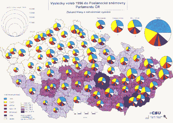
Choropleth Map with Proportional Symbols
from ARCDATA PRAGUE, in GIS: Our Common Language, ESRI Map Book, Volume
12, 1997.
Disadvantages of Choropleth Maps
Although choropleths give a good visual impression of change over space there are certain disadvantages to using them:
- They give a false impression of abrupt change at the boundaries of shaded units.
- Choropleths are often not suitable for showing total values. Proportional symbols overlays (included on the choropleth map above) are one solution to this problem.
- It can be difficult to distinguish between different shades.
- Variations within map units are hidden, and for this reason smaller units are better than large ones.
Isopleth maps
Isopleth maps differ from choropleth maps in that the data is not grouped to a pre-defined unit like a city district. These maps can take two forms:
- Lines of equal value are drawn such that all values on one side are higher than the "isoline" value and all values on the other side are lower, or
- Ranges of similar value are filled with similar colours or patterns.
This type of map is ideal for showing gradual change over space and avoids the abrupt changes which boundary lines produce on choropleth maps. Temperature, for example, is a phenomenon that should be mapped using isoplething, since temperature exists at every point (is continuous), yet does not change abruptly at any point (like population density may do as you cross into another census zone). Relief maps should always be in isopleth form for this reason.
|
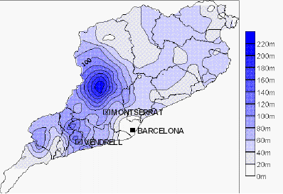
Isopleth example: precipitation 10th June 2000 (mm)
The disadvantage of isopleths are that they are unsuitable for showing discontinuous or 'patchy' distributions and a large amount of data is required for accurate drawing.
Proportional Symbol Maps
As the name implies, symbols (most often circles) are drawn proportional in size to the size of the variable (e.g. employment change) being represented. Proportional symbol maps are not dependent on the size of the area associated with the variable. In other words, on a proportional symbol map of Europe, tiny Liechtenstein would have the same visual importance as Spain if their unemployment values were the same. This would not be the case with a choropleth map.
An example of proportional circles is shown on the Czech Republic Voting Register map (above).
Scaling proportional symbols. Much research has gone into the optimal scaling for proportional symbols. As a general rule, make sure that the area, rather than linear proportions like radius or length of a side, is the scaled parameter. For example, if there are four times as many gentrified businesses in El Raval Site 1 than in Site 3, the area of the symbol should be four times greater for Site 1. If the symbol choice is a circle, the radius of the Site 1 symbol should thus be only twice as great (since area scales with the square of the radius).
Dot maps
Used to show the distribution of phenomena where values and location are known. Dot maps create a visual impression of density by placing a dot or some other symbol in the approximate location of the variable being mapped. Dot maps should be used only for raw data, not for prearranged data or percentages. Appropriate themes for dot maps include the distribution of dairy farms, and population distribution in a region.
Their limitations include the difficulty of counting large numbers of dots in order to get a precise value and the need to have a large amount of initial information before drawing the map.
Dot map parameters. When constructing a dot map, two parameters must be considered: the graphical size of each dot and the value associated with each dot. For example, you might stipulate that each dot be 2 pixels in diameter, and each represent 100 persons. In general, many small dots, each representing relatively few instances of the attribute, is more effective than a few large dots, but is more tedious to construct.